Das rote Buch stellt Architektur, Kritik und vor allem die Kritiker selbst in den Mittelpunkt. In elf Gesprächen, die Architekt und Herausgeber Michael Gebhard mit renommierten Architekturkritikern geführt hat, unter anderem mit Dieter Bartetzko (FAZ), Friedrich Achleitner, Gerhard Matzig (SZ) und Hanno Rauterberg (Die ZEIT), wird die heutige Architekturkritik selbst betrachtet und in ihrer Relevanz oder auch Irrelevanz, ihren Chancen und Defiziten ausgelotet. Die Titelgestaltung des in Rot („die Farbe der Kritik“, M. Gebhard) gehaltenen Buches als typografische Endlosschleife „Kritik der Kritik der“ visualisiert klar, dass jede Kritik wiederum der Kritik unterliegen kann. Hardcover mit Fadenheftung, Siebdruck und Farbschnitt.
This red book focuses on architecture, critique and, in particular, the critics themselves. Contemporary architectural critique is examined and its relevance or even irrelevance, its opportunities and deficits are evaluated in eleven interviews held by the architect and editor Michael Gebhard with renowned architecture critics, including Dieter Bartetzko (FAZ), Friedrich Achleitner, Gerhard Matzig (SZ) and Hanno Rauterberg (Die ZEIT). The cover design of the red book (red being “the colour of critique”, M. Gebhard) in a typographical infinite loop (“critique of the critique of the critique…”) visualises clearly that each critique can be the subject of another critique. Hardcover with stitch binding, screen printing and edge colouring.
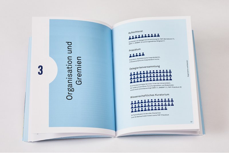
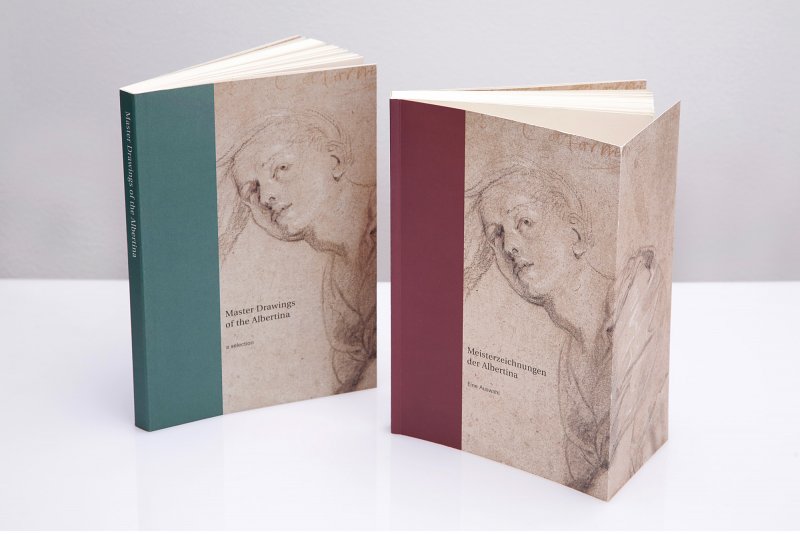
DAM Architectural Book Award 2015 Shortlist