Dominikuszentrum

AUFTRAGGEBER
Meck Architekten

LEISTUNGEN
Typografisches Gesamtkonzept
Kunst am Bau, Schriftziegel
Schriftzug
Beschriftung am Gebäude
Urkunde
Grundsteinplatte
Buch


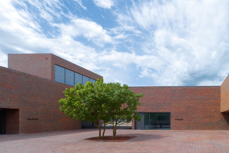
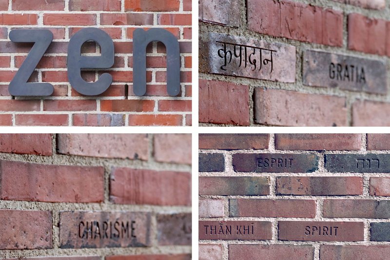
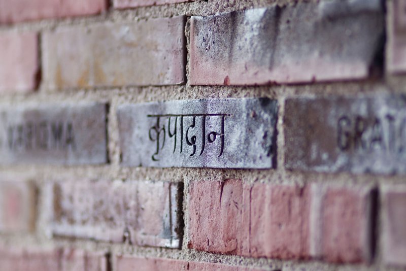
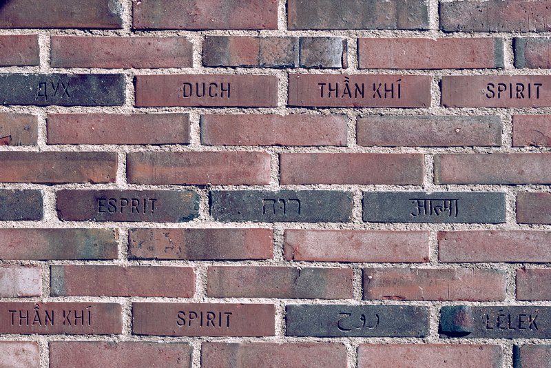
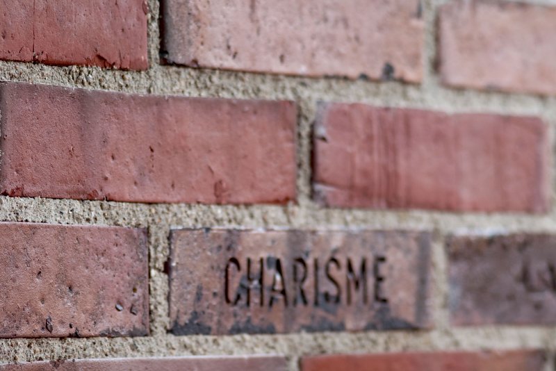
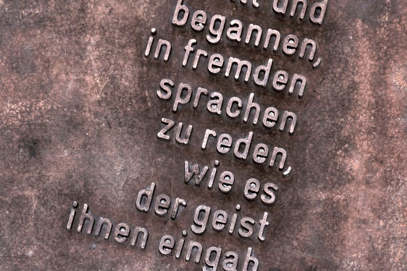
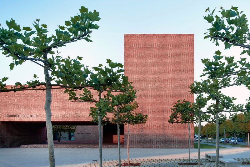
Das Dominikuszentrum ist der Neubau eines kirchlichen Stadtteilzentrums in München. Das Konzept zur typografischen Gestaltung der Zu- und Durchgänge orientiert sich am verwendeten Material der Anlage – hochwertig gebrannter roter Ziegel. In die Wände des westlichen Hauptzuganges sind die Begriffe für die sieben Gaben des Heiligen Geistes und in den Durchgängen Nord und Ost die Begriffe Gabe und Geist in 29 bzw. 22 verschiedenen Sprachen und in unterschiedlichen Schriftformen (wie Lateinisch, Kyrillisch, Griechisch, Hebräisch, Arabisch, Hindi, Vietnamesisch, Chinesisch oder Japanisch) in die Ziegel subtil geprägt und präzise gereiht. Das Konzept der Prägung verweist auf die ältesten, gekerbten und geschnittenen, also plastischen Erscheinungsformen der Schriftlichkeit, wie Hieroglyphen- oder Keilschrift. „Die Schriftzüge auf den Ziegeln, die bündig in die Mauer gesetzt sind, neben den nicht beschrifteten Ziegeln gleichberechtigt eingemauert, verwandeln die Wand zum Informationsträger, zum öffentlichen Medium. […] Die Verteilung der Schriftzüge wirkt leicht und frei, das Verhältnis zwischen vertikaler und horizontaler Ordnung erzeugt eine Art Strömungsdiagramm. Die Richtung des Stroms weist in den Hof des Gebäudes. […] Wenn Schrift und Architektur eine Synthese eingehen, wird dem Schriftlichen eine Dauer verliehen, die es im ephemeren Bereich der papierenen Information niemals erreicht. […]" (Elisabeth v. Samsonow). Kooperation: Barbara Butz-Glas. Fotografien: Michael Heinrich, Florian Holzherr


The Dominikuszentrum is a new church community centre in Munich. The typography concept for the entrances and passages refers to the material of the building – high-quality, fired red bricks. The German words for wisdom, understanding, counsel, fortitude, knowledge, piety, and fear of the Lord – the seven gifts of the Holy Spirit - can be read on the walls of the main entrance to the west, and in the northern and eastern passages the words gift and spirit are to be found in 29 and 22 different languages and scripts respectively (including Latin, Cyrillic, Greek, Hebrew, Arabic, Hindi, Vietnamese, Chinese and Japanese), subtly embossed on the bricks and set precisely side by side. The concept of embossing refers back to the most ancient forms of writing, such as the mysterious script of the Indus Valley culture, the hieroglyphs of the Egyptians, or the cuneiform script of the Assyrians. “The embossed bricks, flush with the surface, laid in the same way as the plain ones, transform the wall into a bearer of information, a public medium. […] The spacing of the words is light and free, the relation between vertical and horizontal ordering creates a kind of flow chart, with the direction of flow pointing into the building’s courtyard. […] When writing and architecture are synthesised, the written word is given a durability it never achieves in the ephemeral realm of “paper” information. […]” (Elisabeth v. Samsonow). Cooperation: Barbara Butz-Glas. Photographs: Michael Heinrich, Florian Holzherr
AUFTRAGGEBER
Meck Architekten

LEISTUNGEN
Typografisches Gesamtkonzept
Kunst am Bau, Schriftziegel
Schriftzug
Beschriftung am Gebäude
Urkunde
Grundsteinplatte
Buch


Podersdorf

AUFTRAGGEBER
Lichtblau Wagner Architekten

LEISTUNGEN

Typografische Konzeption
Gestaltung
Produktion


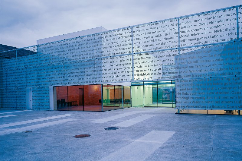
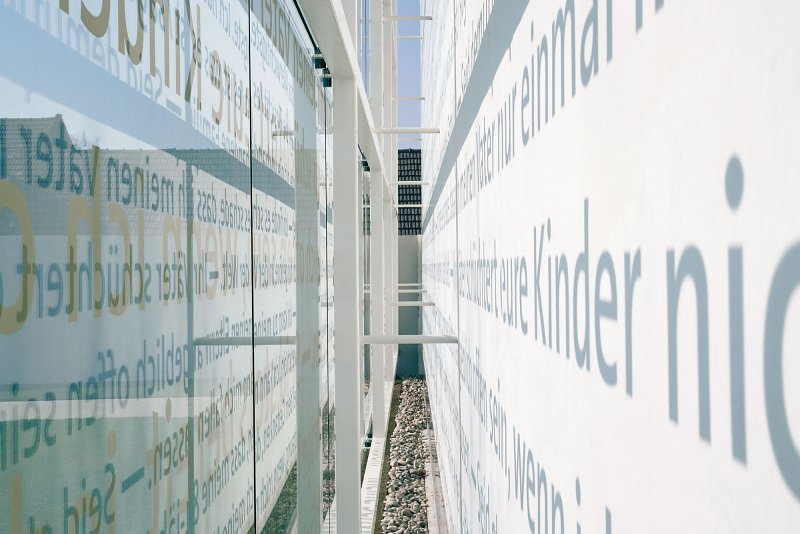
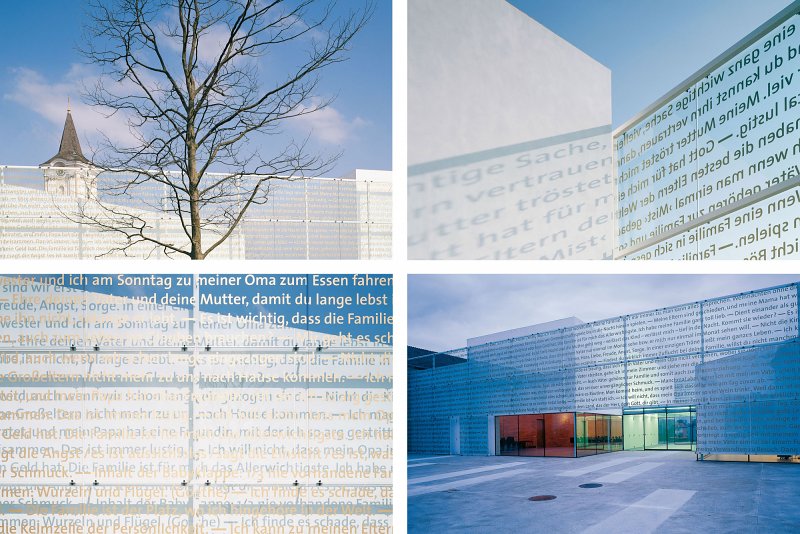
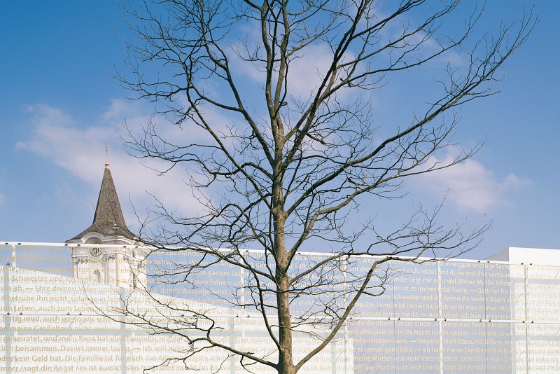
Das neu gebaute Pfarrzentrum in Podersdorf wird von zwei Glasfassaden bestimmt, zwischen denen sich ein Gottesdienstraum und das Gemeindezentrum befinden. Die typographische Gestaltung dieser Fassaden basiert auf Statements der Gemeindemitglieder zum Thema ‹Familie› und Zitaten. Die Glasfassaden machen neugierig, rücken das Pfarrzentrum in das Blickfeld der Passanten und laden zum Besuch ein. Die goldene Schrift auf 57 Einzelelementen der 40 x 7 Meter großen Glasflächen erforderte ein hohes Maß an typografischer Detailarbeit und erzeugt in ihrer Ausgewogenheit eine starke visuelle Wirkung. Nähe und Ferne erzeugen ein optisches Spiel zwischen konkreter Aussage und dekorativem Bild, zwischen Inhalt und Form. Kooperation: Maximilian Sztatecsny. Fotografien: Bruno Klomfar, Margherita Spiluttini


The newly built parish centre in Podersdorf is characterised by two glass façades between which the chapel and parish hall are located. The typographic design of these façades is based on statements by members of the parish concerning the theme “family” and citations. The glass façades arouse curiosity, attract the attention of passers-by to the parish centre, and appear inviting. The golden type on 57 individual elements of the 40 x 7 m glass surfaces required highly detailed typographic work and creates a strong visual effect in its balance. Proximity and distance create optical interaction between a concrete message and a decorative image, between content and form. Cooperation: Maximilian Sztatecsny. Photographs: Bruno Klomfar, Margherita Spiluttini


AUFTRAGGEBER
Lichtblau Wagner Architekten

LEISTUNGEN

Typografische Konzeption
Gestaltung
Produktion


Weinlandbad

AUFTRAGGEBER
Runser / Prantl Architekten

LEISTUNGEN

Typografische Konzeption
Schriftzug
Piktogramme
Beschilderung
Leitsystem

Produktion


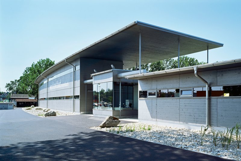
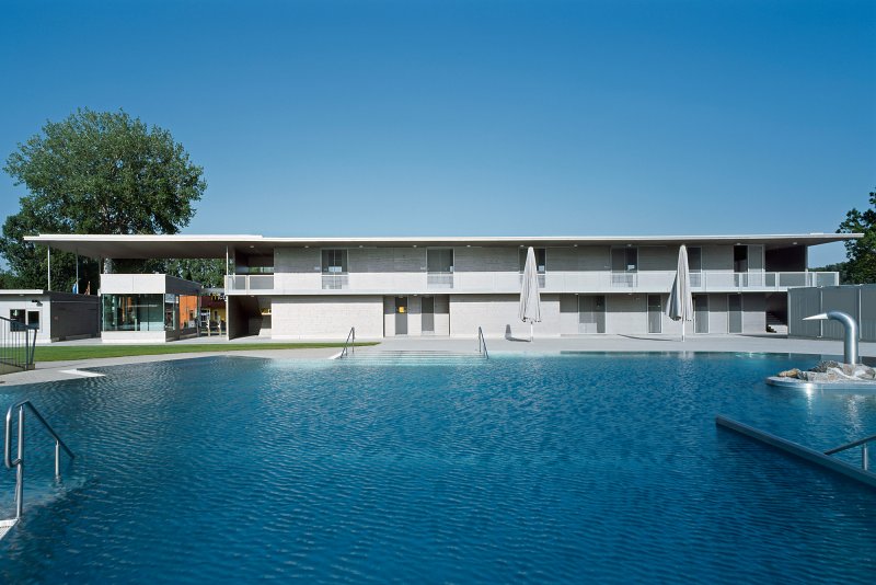
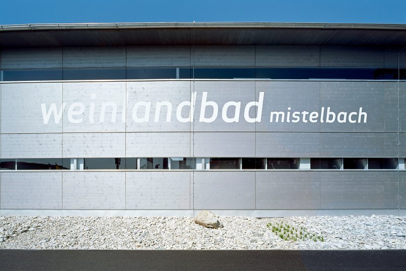
Fassadenbeschriftung und transparentes Leitsystem mit Piktogrammen für die mit dem Holzbaupreis Niederösterreich ausgezeichnete Freibadeanlage in Mistelbach. Das unter dem Namen „Weinlandbad“ bekannte Freibad zählt zu den größten Erlebnisbädern Niederösterreichs. Der leicht geschwungene Neubau mit zentralem Eingang umfasst Arzt-, Physiotherapie- und Massageeinrichtungen, Trainings-, Wellness- und Saunabereiche sowie ein Restaurant. Fotografien: Rupert Steiner


Typography on façades and transparent orientation system with pictograms for the outdoor pool in Mistelbach, which has received the Lower Austria award for timber construction. Known as the “Weinlandbad”, this pool is one of the biggest aqua parks in Lower Austria. The slightly curved new building with a main entrance includes medical, physiotherapy and massage facilities, training, wellness and sauna areas as well as a restaurant. Photographs: Rupert Steiner


AUFTRAGGEBER
Runser / Prantl Architekten

LEISTUNGEN

Typografische Konzeption
Schriftzug
Piktogramme
Beschilderung
Leitsystem

Produktion


Wiener Staatsoper

AUFTRAGGEBER
Kiskan-Kaufmann +
Venturo Architekten

LEISTUNGEN
Idee
Entwurf


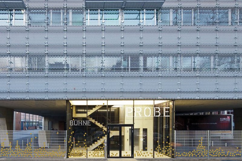
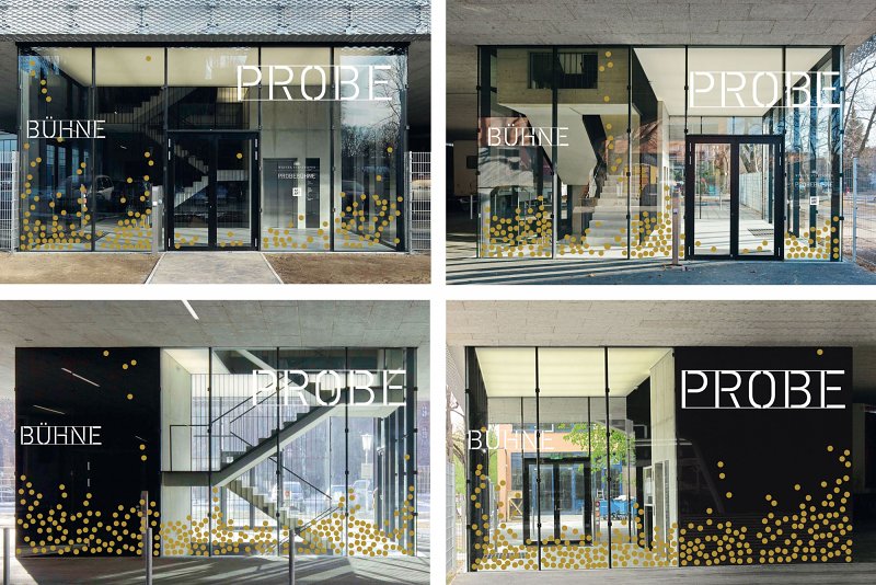
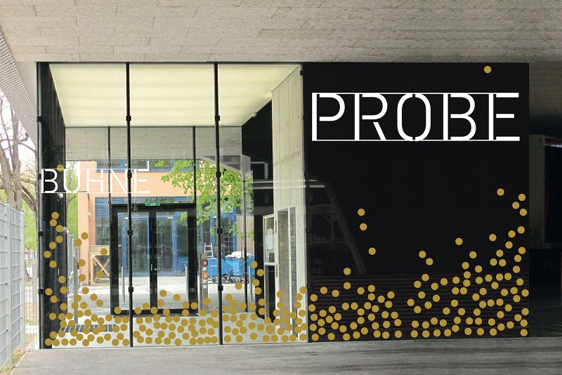
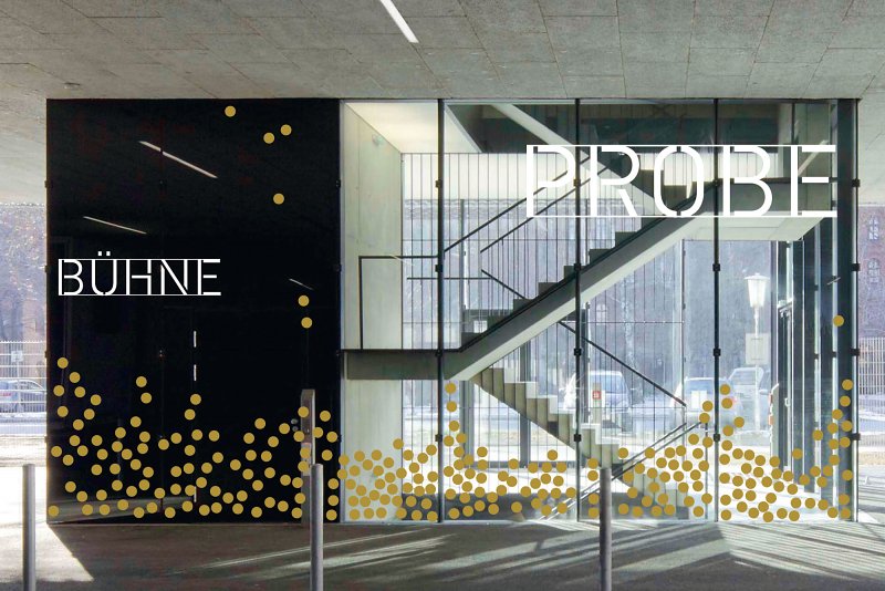
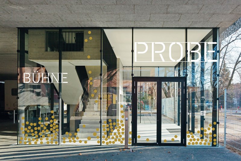
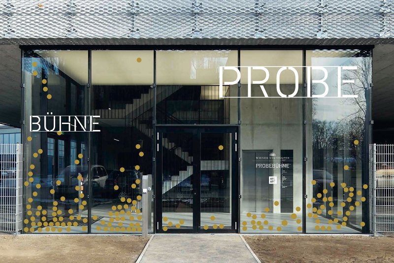
Die neue, metallverkleidete Probebühne der Wiener Staatsoper lässt kaum erahnen, welche außergewöhnliche künstlerische Kreativität im Inneren entsteht. Sie bildet exakt die Bühnendimensionen des Hauses am Ring ab, eine entscheidende Verbesserung, da nun mit Kulissen geprobt werden kann. Das Eintauchen in die inspirierende Kunstwelt beginnt bei der Annäherung an das Gebäude, die durch eine goldfarbene, an die Oberfläche sprudelnde Quelle an Zaun und Glaskubus symbolisiert wird – den Schöpfungsmythos assozierend. Die Weiterführung der Punkte in der Horizontalen verweist auf den Probenprozess: Entwicklung, Bewegung, Fluss.


The new, metal-clad rehearsal stage for the Vienna State Opera makes it hard for the onlooker to imagine the extraordinary artistic creativity arising within its interior. It mirrors the stage dimensions of the main opera building precisely - a decisive improvement because this makes it possible to rehearse with scenery. Upon approaching the building, the process of entering this inspiring world of art is symbolised by a golden spring gushing to the surface at the fence and glass cube – an association with the creation myth. The horizontal continuation of the dots is a reference to the rehearsal process: development, movement, flow.


AUFTRAGGEBER
Kiskan-Kaufmann +
Venturo Architekten

LEISTUNGEN
Idee
Entwurf